I've been iterating on an open source self-custodial mobile Lightning app using LDK Node, here has been my development & design process so far.
Beginning
Last year myself and Steve Myers sat down on a Monday to just test out the Swift bindings for pre-v0.1 LDK Node. Our goal was just to test building them, importing them in an iOS app, starting the node, then getting the node ID and a wallet address.
LDK Node uses BitcoinDevKit for the on-chain wallet so testing it and iterating on it would create a nice feedback loop for BDK as well.
With the combination of LDK Node and BitcoinUI (Bitcoin Design’s UI Kit for iOS) I knew I could get something working well out of the box that had sensible design primitives baked in.
Part of the promise of LDK Node is abstracting the really tricky bits of the Lightning Protocol; part of the promise of the BitcoinUIKit is as a design foundation for open source projects to kickstart their design process. Both LDK Node and BitcoinUIKit really free up a developer/designer to focus on using their specific viewpoint to create a uniquely great product and user experience.
Crack
So I took the next step to get every high level feature working properly in the iOS app on regtest -> signet -> testnet, and I started to crack open all of the features individually so I could get a feel for how they worked and how I wanted the app to work.
Multiple tabs, separate bitcoin and lighting, etc.
Once I had it to a point where the app basics worked I started to spread all of the features out individually so I could get a feel for how they worked and how I wanted the app to work.
From there I used the app successfully on mainnet to buy a drink at Bitcoin Park. This was a turning point in my process because it moved from idea/theory to something very tangible.
Collapse
At this point the app worked *and* I also had a better idea of how I wanted the app to work and feel, so it was time to start to collapse down all of the features into a flow.
Here is a snippet of that compressed flow today, sending from Monday to Primal via my channel with Voltage.
1 main screen, bitcoin and lightning together, etc.
UI/UX
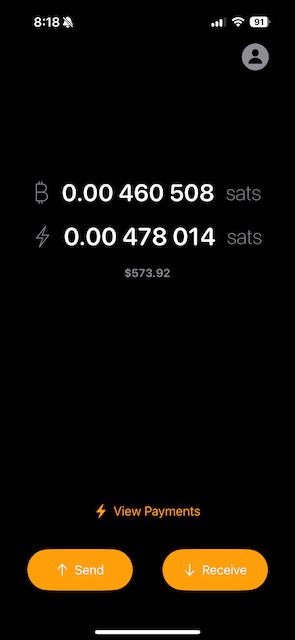
I still have a lot of open UI/UX questions, for example a seemingly simple thing is that recently merged into LDK Node was more exposure to balance information and my preferred way of seeing balances at the moment is this… but is it the best way?
Sat symbol, formatting, fiat, etc.
LDK Node is adding features quickly… also recently added was support for LSP2 which the iOS app now supports on mutinynet and I can already tell it will have a positive (and large) effect on the UI/UX flow.
What’s great is that since the iOS app supports all networks (mainnet/testnet/signet/regtest) any new feature shipped on LDK Node can be integrated immediately on any/all of those networks, being able to test across all networks and in the real world is super valuable.
For example there are things like payment reliability that I didn’t have complications with on the test networks but found out was a bit more complicated in the real world on mainnet (obviously), Mutiny has an incredible breakdown of their approach to fixing payment reliability.
What’s next?
Cracking open distinct features and exploring each one independently to understand its functionality, limitations, and how it interacts with other parts of the system was an important start to the process for me; the next steps of then tightly integrating all of them together once I had a good grasp of each component and how they should work together was an important next step for creating a great user experience.
I’m deeper down the Lightning rabbit hole, the magic, the complexities, and have never been more bullish. If you’re interested in Lightning apps on mobile all it takes is a few minutes to get started:
💻 Run (1 min)
📖 Read (2 min)
🎬 Watch (20 min)


