Introducing BDK Swift Example Wallet
Design Decisions
Bitcoin Dev Kit 1.0 has arrived, bringing with it powerful features and improvements for bitcoin application developers. To showcase how these capabilities can be used in a iOS app, I developed BDK Swift Example Wallet, an example app that leverages the Swift bindings provided by bdk-ffi.
In this post, I'll walk through the design principles and implementation choices that guided the creation of this example app. My goal is to highlight specific decisions I made, some of which align with best practices commonly seen in other wallets and some that intentionally deviate from them.
Audience
The people that might enjoy this wallet are people looking to:
Test
Bitcoiners interested in an iOS test wallet that supports networks like Signet & Testnet, allowing them to play around with bitcoin without using real funds.
Explore
Developers looking to explore BDK 1.0 and experiment with the new features of BDK 1.0.
Fork
Developers wanting to build on or fork this project using it as a solid starting point to create their own wallet or bitcoin-related app or adding a specific feature or idea to it.
"Everything Should Be Made as Simple as Possible, But Not Simpler"
— Albert Einstein
Native
Most people will use bitcoin primarily on mobile devices, so focusing on a smooth and intuitive mobile experience was essential. This is why I aimed to build an app that leverages the power of BDK and feels like a true iOS native app, intentionally crafted to feel as natural on the platform as possible, where the use of built-in elements like bitcoin SF Symbols, light & dark mode, Dynamic Type, gestures and animations, and other iOS native components enhance usability for users.
When an app feels native, it makes even complicated tasks seem straightforward; conversely, if the app doesn't feel like it belongs on the platform, even simple tasks can feel more difficult than they should.
Onboard
A key focus area for the app was creating an onboarding experience that gets users into the app with minimal friction. The features I focused on were:
Create a new wallet or import a wallet
Choose a test network and esplora
Originally, I experimented with a more complicated onboarding flow that spanned 2+ screens and offered more customization options, yet that also offered more surface area for users to get stuck. But I was really focused on preventing the user from feeling overwhelmed or stuck when they first open the app, I wanted to get them onboarded feeling confident and excited with momentum to continue using the app.
So I streamlined onboarding to one screen, set the default network to Mutinynet, and made creating or importing a wallet one-tap actions.
Wallet
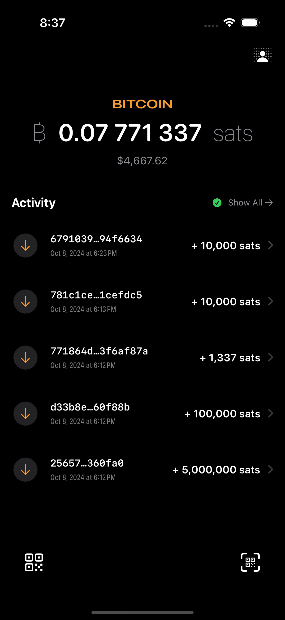
I used a custom approach to balance formatting that I haven't seen implemented the same exact way elsewhere; it resembles the satcomma standard, but I opted for a variation that makes the most sense to me reading when I’m reading a balance amount:
~0.07 bitcoin
~7 million sats
For ease of use on mobile devices, the "Send" and "Receive" actions are positioned at the bottom of the screen, within easy reach of a user’s thumb. To keep the design minimal, these actions are represented by icons that make sense for a mobile wallet:
Show QR (Receive)
Scan QR (Send)
… rather than text, making the interface cleaner and more efficient.
Sync
One of the features I was most excited about in BDK 1.0 was the ability to inspect Script PubKeys (SPKs) during wallet sync, because I could immediately imagine in my head how great that could look in a wallet.
The halting problem is the problem of determining… whether the program will finish running, or continue to run forever.
Instead of staring at a spinner with no idea what's going on behind the scenes while your app is syncing, users can now see a visual representation of the wallet's state in real-time. I think that seeing the inspected SPKs in action not only enhances the user experience but also helps users learn how a bitcoin wallet works; it transforms what could be a frustrating wait into an opportunity to gain a deeper understanding of their wallet.
Receive
I implemented visual formatting for bitcoin addresses based on the Bitcoin Design Guide. This formatting helps users quickly recognize the structure of a bitcoin address, reducing the chance of errors when copying or sharing it. By clearly presenting the address in a more digestible format, users are encouraged to review the entire address, which can help prevent mistakes during transactions.
Send
I've seen similar send flow in a lot of my favorite wallet apps, and I think it's a great approach that I wanted to stay consistent with since it creates a clean and intuitive experience.
Seed
I referred to the guidelines from the Bitcoin Design Community's Daily Spending Wallet for anytime the seed was shown in the app that it was presented which creates a nice visual representation of the seed words for a user.
Download
By focusing on simplicity, transparency, and native design principles, I've tried to develop and design a wallet that feels right at home on iOS while staying true to the needs of bitcoin users and developers.
Anyone interested in BDK Swift Example Wallet can check out it out on GitHub and download it on TestFlight.


